Token by token, chunk by chunk — streaming changes how users read, trust, and interact with AI output. Here's the craft of doing it well.
Word by word the answer grows, Cursor blinking, user knows Something's thinking, something's near — Blank screens break trust. Streams build it here.
I Why Streaming Is a UX Decision
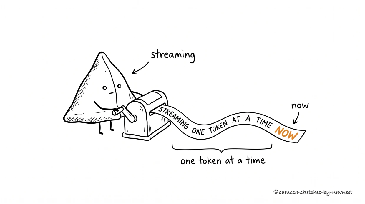
Streaming means the answer arrives one token at a time. The user reads as the model writes — the wait becomes a performance, not a blank screen.
Streaming means the answer arrives one token at a time. The user reads as the model writes — the wait becomes a performance, not a blank screen.
The Cost & Latency series covered streaming as a performance optimization: same total time, better perceived speed. That's true but incomplete. Streaming fundamentally changes the user's relationship with AI output.
Streaming builds trust through transparency.When a user watches text appear word by word, they're seeing the AI "think." They can start evaluating the response before it's complete. They can interrupt if it's heading in the wrong direction. This isn't just faster — it's a fundamentally different cognitive experience than staring at a blank screen and then receiving a wall of text.
Streaming changes reading behavior. With batch responses, users scan. With streaming, they follow— reading at roughly the pace of generation. This means the first few sentences carry disproportionate weight. If the opening is wrong, the user has already mentally rejected the response before it finishes. If the opening is right, they're engaged and forgiving of later rough patches.
Streaming creates the illusion of dialogue. Even in a single turn, token-by-token output feels like a conversation — someone formulating a thought in real time. This matters for trust: users rate identical content higher when it appears to stream versus appearing all at once. The medium shapes perception of the message.
Key Insight
Streaming is not optional for AI products. It's the baseline UX expectation. Users who've experienced ChatGPT, Claude, or Gemini expect token-by-token output everywhere. A product that shows a loading spinner for 8 seconds and then dumps text feels broken by comparison — even if the response is better. Perceived quality is actual quality in UX.
II The Three Modes
Not all streaming is created equal. Three patterns cover most use cases, and picking the wrong one creates a jarring experience.
Token-by-Token
The classic. Characters appear as the model generates them, like watching someone type. Best for conversational interfaces where the output is prose — chat, email drafts, explanations, summaries. The user reads along with the generation and the stream itself is the experience.
When it breaks: Structured output. Watching a JSON object appear character by character is meaningless to most users. A table streaming cell by cell is confusing. If the output has structure, token-by-token exposes the wrong level of abstraction.
Chunked Reveal
Output appears in meaningful chunks — a complete paragraph, a finished table row, a full code function. The model streams behind the scenes; your UI buffers until a logical unit is complete, then reveals it with a smooth transition. Best for structured or sectioned output where partial tokens are meaningless.
When it breaks: Long waits between chunks. If your model writes 500 tokens before the first chunk is ready, the user sits through a loading state that streaming was supposed to eliminate. The chunk size needs to balance coherence with perceived responsiveness.
Skeleton-to-Content
Show the output structure immediately — headers, placeholders, empty sections — then fill in each section as the model completes it. Best for dashboards, reports, and multi-section outputs where the user wants to see the shape of the answer before the details arrive.
When it breaks: Unpredictable structure. If the model might produce 3 sections or 7, showing a skeleton with 5 placeholders creates a mismatch. Skeleton-to-content works when you know the output structure in advance — which means it works best with constrained prompts.
Interactive
Stream Modes Compared
Click a mode, then play to see the difference.
III Designing the Stream
The details of streaming UX are the difference between "feels alive" and "feels janky."
Typography.Streaming text needs slightly more line-height than static text because the user's eye is tracking a moving target. 1.6–1.8 for body text (vs. 1.4–1.5 for static). Use a serif or proportional font — monospace fonts make token-by-token streaming look like a terminal, which is fine for code but alienating for prose.
The cursor.A blinking cursor at the insertion point is the universal "still generating" signal. Remove it the moment generation completes. If the cursor lingers after the response is done, users wait for more text that never comes. If it disappears during generation (a common bug), users think the response is finished.
Scroll management. Auto-scroll to keep the latest content visible, but stop auto-scrolling if the user scrolls up. Nothing is more frustrating than reading the middle of a response and being yanked back to the bottom. Resume auto-scroll only when the user scrolls back to the bottom themselves. This is a solved problem that teams still get wrong constantly.
The "stop generating" button.Every streaming interface needs one. Prominent, always visible during generation, and it must actually work — stopping the stream and keeping whatever was generated so far. Users use this more than you think: they see the answer they need in the first paragraph and don't want to wait (or pay) for the rest.
Builder Tip
Stream the first token fast. Time-to-first-token (TTFT) matters more than total generation time for perceived speed. A response that starts in 200ms and takes 5 seconds to complete feels faster than one that starts in 2 seconds and takes 3 seconds total. Optimize TTFT: smaller system prompts, prompt caching, model routing to faster models for simple queries.
IV Errors Mid-Stream
What happens when the model fails halfway through a response? The user has already read three paragraphs. They've started forming an opinion. And then — nothing. The stream stops. Or worse, the entire response disappears and gets replaced with "Something went wrong."
Three patterns for handling mid-stream failures, in order of user experience quality:
1. Keep and mark.Preserve everything generated so far. Append a clear indicator: "[Response interrupted — the model encountered an error. What was generated above may be incomplete.]" The user keeps the partial output and decides whether it's useful. This is almost always the right choice — partial information is better than no information.
2. Keep and retry.Preserve the partial output, then automatically retry from where it stopped. Show a brief "Continuing..." indicator. This works well for network timeouts but poorly for model errors (which will likely recur). Use with a retry limit — two attempts, then fall back to "keep and mark."
3. Replace and retry. Clear the partial output and start over. This is the worst user experience (they watched three paragraphs vanish) but sometimes necessary for errors that corrupt the output context. Only use this for errors where partial output is actively misleading — not for timeouts or rate limits.
Key Insight
Never silently discard partial output. Users saw it appear. They started processing it. Deleting it without explanation feels like gaslighting. Even if you need to retry, tell the user what happened and give them the choice to keep or discard what they already saw.
Interactive
Error Recovery Patterns
The model failed at 60% completion. Click a recovery pattern to see how it looks.
Keep & MarkPreserve + indicate
Keep & RetryPreserve + auto-continue
Replace & RetryClear + start over
V Beyond the Chat Box
Most streaming UX advice assumes a chat interface. But AI is increasingly embedded in non-chat contexts where streaming needs different patterns.
Tables.A financial report with 20 rows. Don't stream cell by cell — it's unreadable. Stream row by row with a subtle slide-in animation. Show column headers immediately (you know the structure). Add a running count: "12 of ~20 rows." Users can start working with early rows while later ones generate.
Code. Stream function by function, not character by character. Buffer tokens until a logical unit is complete (a function, a class, a comment block), then reveal with syntax highlighting already applied. Character-by-character code streaming causes layout thrash as the highlighter re-parses on every token.
Summaries and reports.Use skeleton-to-content. Show the section headers immediately ("Key Findings," "Risks," "Recommendations"), then fill each section as it completes. Users can jump to the section they care about without waiting for the whole document. This is how a16z frames the next phase of AI UX: away from chat-as-interface, toward structured outputs that the user navigates rather than reads linearly.
Suggestions and autocomplete. These need to appear instantlyor not at all. Any visible streaming in an autocomplete widget feels laggy. Buffer the full suggestion behind the scenes and reveal it as a single unit. If the model can't respond in under 300ms, show nothing — a slow suggestion is worse than no suggestion because it interrupts the user's flow.
Analogy
Think of streaming modes like presentation styles. Token-by-token is a live speaker — you follow their train of thought in real time. Chunked reveal is a slideshow — each slide appears complete. Skeleton-to-content is an outline that fills in — you see the structure immediately and the details arrive. Match the streaming mode to how your users actually consume the output.
VI The Post-Stream Moment
Generation complete. Cursor gone. Now what? Most AI products treat the end of streaming as the end of the interaction. That's a missed opportunity and sometimes a dead end.
Edit affordances.The moment streaming stops, the output should become editable or actionable. Copy buttons appear. Edit icons become active. If the output is a draft email, an "Edit before sending" button materializes. The transition from "generating" to "ready" should be visible and immediate.
Follow-up prompts.Suggest 2–3 natural next actions based on what was generated. "Make it shorter," "Change the tone to formal," "Add examples." These reduce the blank-prompt-box problem — users who don't know what to ask next will click a suggestion. Users who know exactly what they want will ignore them.
The dead-end problem.If the AI's response is wrong or unhelpful, the user needs a clear path forward. "Regenerate" is the minimum. Better: "Regenerate with different approach," which signals to the model that the first attempt was unsatisfactory. Best: an inline feedback mechanism ("What was wrong?") that informs the retry.
Takeaway
Streaming is the AI UX baseline. The three modes (token-by-token, chunked reveal, skeleton-to-content) each fit different output types. The craft is in the details: fast first token, smart scroll behavior, a stop button that works, graceful mid-stream error recovery, and a post-stream moment that turns output into action. Every second the user watches a blank screen is a second they're losing trust.
Test your understanding
Article Recap
5 questions covering the key concepts from this article.
1 of 5
Your AI product generates financial reports (tables + prose + recommendations). Which streaming mode is most appropriate?